Top 100 2021 – Feat. Subjects

Warning: there will be a little bit of maths. I’m going to call this the Top 100 Techno Mix. I hope you enjoy it!
As we shared in our November 10th blog, we have decided not to produce our traditional Top 100 this year. We’re taking the year off to rethink and refresh our annual review of society’s engagement with research to produce a format that focuses our analyses on the unique opportunities our data offers: identifying emerging trends, highlighting examples of great engagement, and encouraging researchers to communicate their research and its outcomes as effectively as possible.
In place of our usual Top 100, our Head of Data Insights, Mike Taylor, is paying tribute to the Top 100 of years past with a series of blog posts that each take a different approach to compiling a ‘top 100’. This time Mike is taking the approach we used with the 2020 Top 100 and seeing how the data from this year plays out.
Our approach to the Top 100 in 2020 was informed by the pandemic, and the effect that discussions and the impact of COVID research had on the volume of attention paid to the pandemic, as well as the degree to which science was discussed on social media and in media outlets. The effects of the pandemic on research communication and engagement are still being seen: in our last Top 100 (the Old School Remix), where we ranked research purely by the Altmetric Score, we found that 98 of the top 100 pieces of research were related to COVID work.
In response to the overwhelming level of COVID-related research last year, our Top 100 approach was to use our subject area classification (based on the Fields of Research taxonomy) to break down the top 100 into 20 groups of 5 high performing articles. We – broadly speaking – followed the same process as earlier algorithms, by excluding letters and editorials.
The FoR taxonomy actually has 22 top level classifications, so you may be wondering why we had 20 categories. When we looked at the data last year, we decided that there was a reasonable amount of overlap between Engineering and Technology, and Life Sciences and Environmental Sciences so we combined those areas. We’ve repeated that approach this year.
This algorithm yielded a much more diverse Top 100 than the original algorithm, and while that was generally well-received, there are definitely some methodological challenges in this approach that I’ll elaborate on below.
Methodology and data
The methodology for this approach (which I’ve informally called the ‘Feat. Subject Areas’) uses a combination of the Altmetric Attention Score, plus the Fields of Research classification, plus a similar set of criteria as for earlier lists (for example, not including letters or editorials). You can find the link to the data on Figshare here, there’s a public summary here and – for Explorer subscribers – the full list is available here, as a saved search.
One of the immediate challenges of this process comes from our tagging process: some articles don’t have any subject area that can be assigned to them within an acceptable level of confidence (it’s driven by a machine classification process), whilst others can have up to four subject areas. In most of our product use-cases, this assignment isn’t an issue: in fact, it’s an advantage that correctly reflects the mix of areas that relate to a research topic, but in the case of this approach to the Top 100, it definitely adds in an area of complexity.
The subject area “Education” threw this process into clarity for me: three of the five articles originally in the Top 5 weren’t really focussed on ‘Education’. Rather they were epidemiological studies of COVID transmission in schools, with virtually no examination of educational policy or practise, or effect on teachers or pupils. Given that we can only accept five articles per subject area, and the purpose of this approach is to create a Top 100 that isn’t dominated by COVID and instead reflects the work within the subject areas, it seems reasonable to rank these three articles as Biological or Medical Sciences, rather than Education.
This curative process was repeated elsewhere: the article that I’ve come to know fondly as “cauliflower breath” could have been in the Top 100 by any one of three subject areas – I felt that Agricultural and Veterinary Sciences was the best classification, but we can discuss that in the comments section. Just not too closely, if you’ve been eating cauliflower.
The science bit
Perhaps unsurprisingly, COVID dominates this Top 100 too, with 29 mentions in the Top 100 Feat. Subjects – but what is interesting is the diversity of the COVID focussed research, and how the focus of research in the last year represents the development of COVID science. If 2020 was the year of understanding the virus, preventing it with a vaccine and experimenting with therapies, 2021 was the year of understanding our reaction to the pandemic – how did governance react, did lockdowns work, what stresses were brought to light in science, what causes skepticism. Interestingly, this shift in focus was not so obvious in the traditional, solely score-based ranking, which maintained its strong focus on vaccines and experimental therapies. Elsewhere in the Top 100, three papers study remote working (but without mentioning COVID – in the titles, at least!), probably influenced by the pandemic.
Just looking at the COVID papers, we get an interesting breakdown. Of particular interest are studies looking at the effectiveness of policy, lockdowns and school closures.
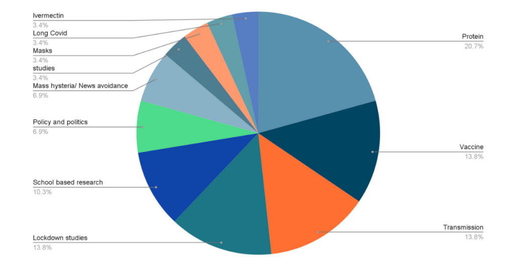
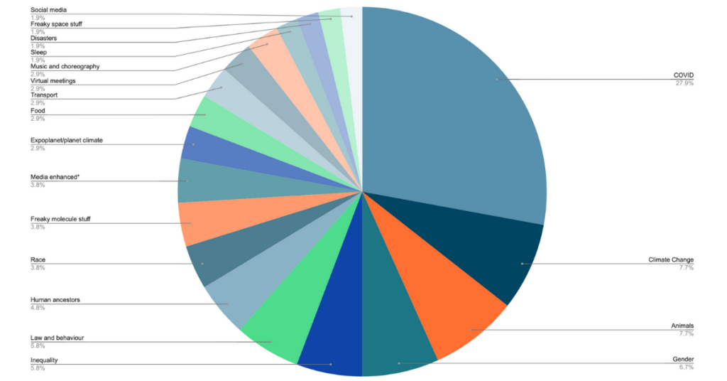
Looking beyond COVID at the other subjects that had more than one article represented (remembering that some papers cover two areas), we can see some really interesting insights into the research that demands our attention. Climate Change is of long-standing importance, research featuring animals, human ancestors and space likewise. This year, a number of papers looked at various areas of inequality, including gender, race, immigration and poverty. Four of the papers featured engaging multimedia – the tectonic plate animation from our last Top 100 makes a reappearance, as does a recording of a prehistoric musical instrument. Food – including our stinky brassica article – features in three articles.
So what attention did the Top 100 Feat. Subject Areas receive?
- Over 660,000 tweets and retweets linked to one of these papers
- Almost 17k news story and blogs posts cited the research
- 187 videos were posted on YouTube
- 223 Wikipedia citations were made
- 36 Policy citations have been detected so far
The top 12 journals were:
- Proceedings of the National Academy of Sciences of the United States of America, 7 articles, with 30,348 mentions mentions,
- Science, 7 articles, with 14,625 mentions,
- Current Biology, with 4 articles, 11,220 mentions,
- Nature, 4 articles, with 10,313 mentions,
- Nature Communications, with 4 articles 57,252 mentions,
- Scientific Reports, 4 articles with 43,549 mentions,
- Nature Astronomy, 2 articles with 871 mentions,
- Nature Human Behaviour, 2 articles with 20,819 mentions,
- PLOS ONE, 2 articles with 378 mentions,
- Science Advances, 2 articles with 5,697 mentions,
- The Journal of Law, Medicine and Ethics, 2 articles with 3,408 mentions,
- Transportation Research, Part D, 2 articles with 1,995 mentions.
The academic institutes in this version of the Top 100 feature a rich mix of organizations. The University of California has 13 articles, MIT and the University of Oxford have six each. Others that caught my eye were Pfizer, American Natural History Museum, Diamond Light and the Royal Horticulture Society. The list is very international, with India, China, Japan, Sweden, Spain, Austria, and Chile all included in the list.
One of the implications of this approach is that there’s a much broader distribution of scores within the Top 100: I’ve plotted the average scores per subject area below.
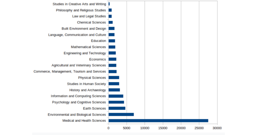
This graph does provide us with some valuable contextual information to understand the ramifications of choosing to acknowledge subject area variations – and perhaps gives us an idea of the stakeholder communities that are engaged with research from different areas.
Preprints were not found in this Top 100 analysis either. Better luck next time!
Conclusion
Building on subject area variations noted above, my next Top 100 will introduce a new methodology which uses normalisation approaches more frequently found in citation-based metrics. In this case, I’ll compare articles’ actual Altmetric Attention Score with an expected Attention Score, based on their mix of subject codes. The resultant index (or ratio) is similar in form to the Field Citation Ratio, Relative Citation Ratio of Field-Weighted Citation Index, in that a value of 1.00 suggests an article is performing “as expected”, a value of 100.00 suggests performance one hundred times better than expected, or 0.5 is half as well as expected. It’s hoped that this approach will yield a Top 100 that reflects a more diverse range of research than the original Top 100 approach, but with a more comprehensible underpinning of data.
Register here to receive the latest news and updates from Altmetric